


Two Times Elliott – Talking Thursdays
2023
Online Talk
Stuttgart Academy of Fine Arts
2022
Class studio visit
Type and Media, KABK
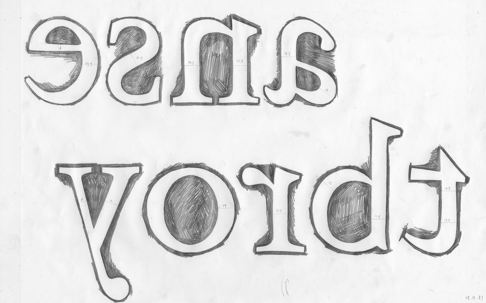
2021–2022
Masters Degree
TypeLab 2022
2022
Online Typeface Talk
Today at Apple – Virtual studio session
2022
Online presentation and demo
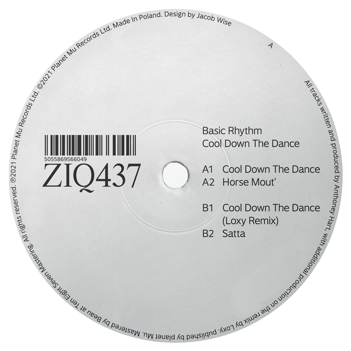
Font Affairs – Zefir7: Type on Tuesday
2021
Online talk about digital type
Beckmans College of Design, Stockholm
2021
Online talk
Falmouth MA Communication Design
2020
Mentoring students
Typojanchi – International Typography Bienalle
2019
Participant
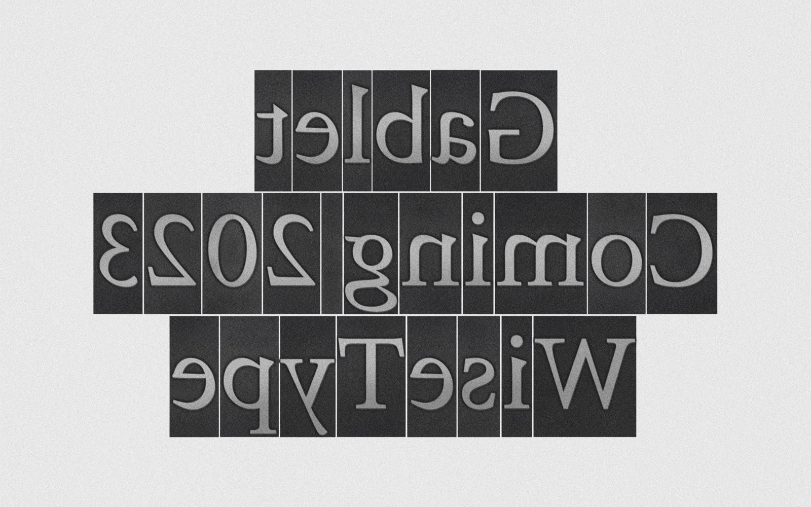
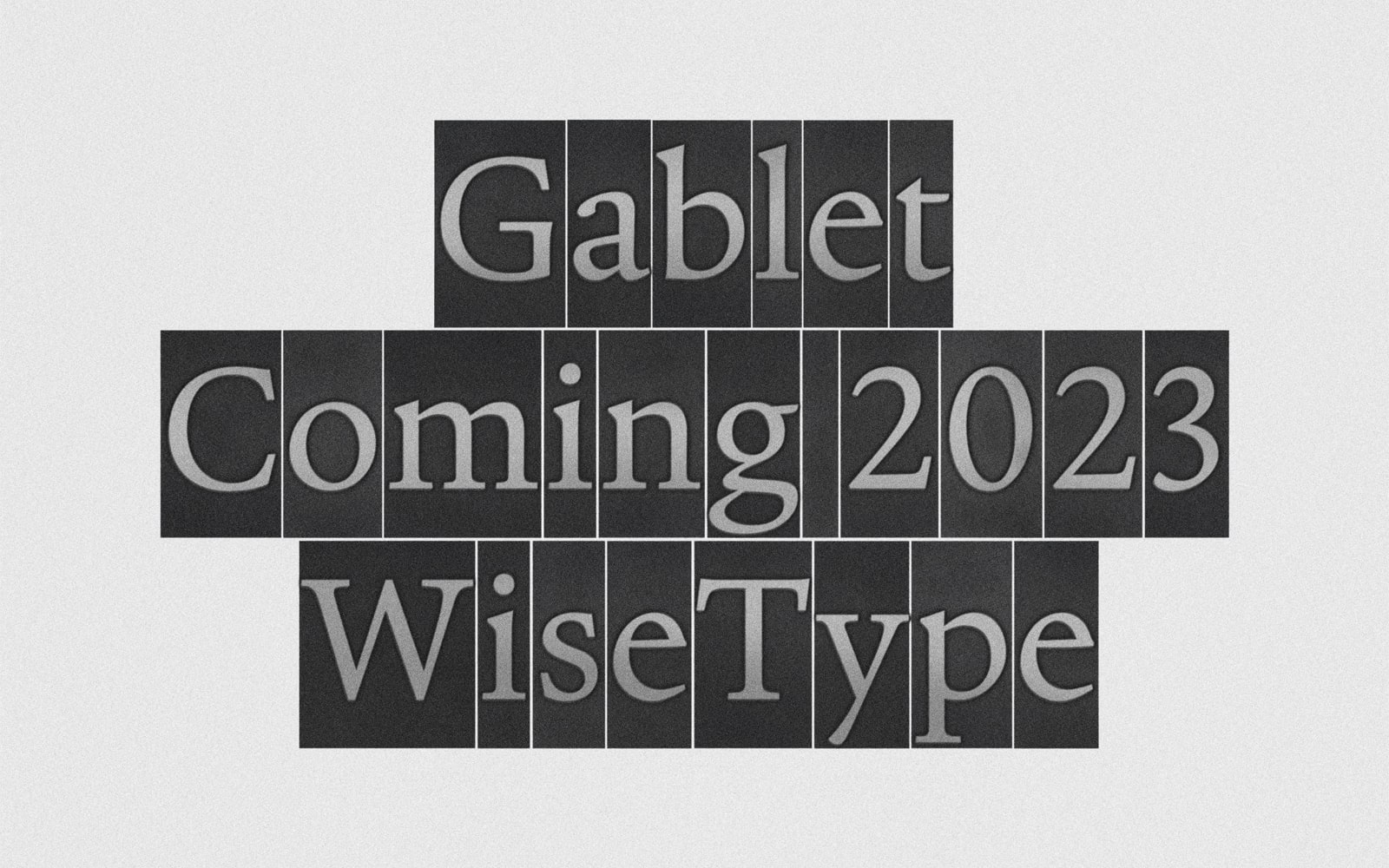
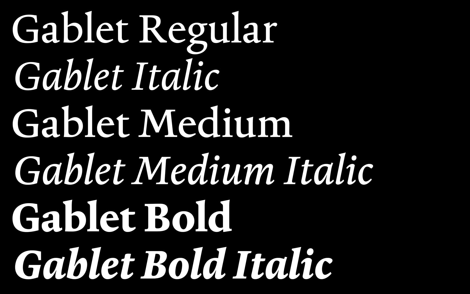
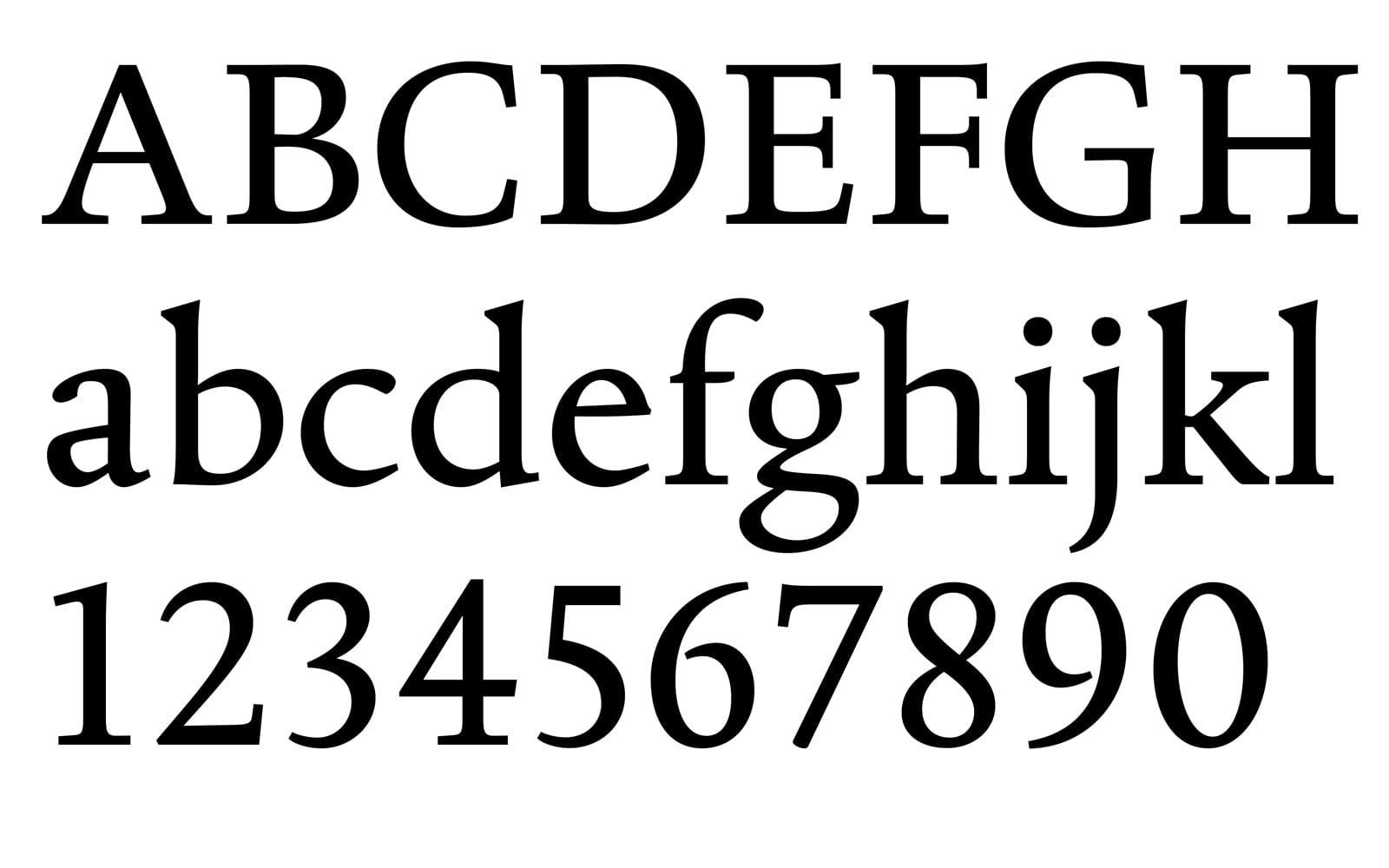
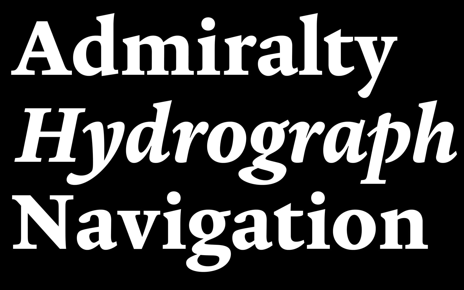
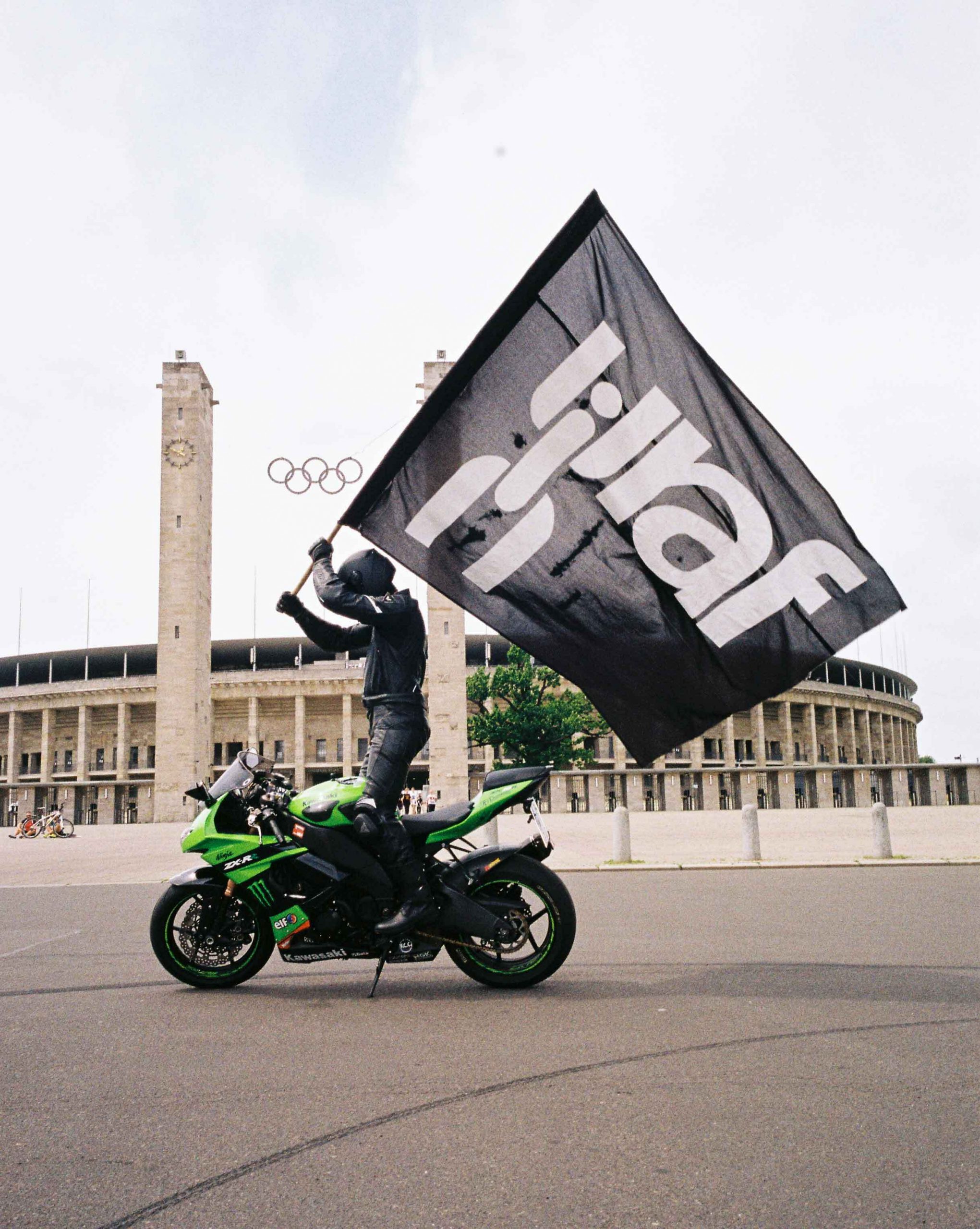
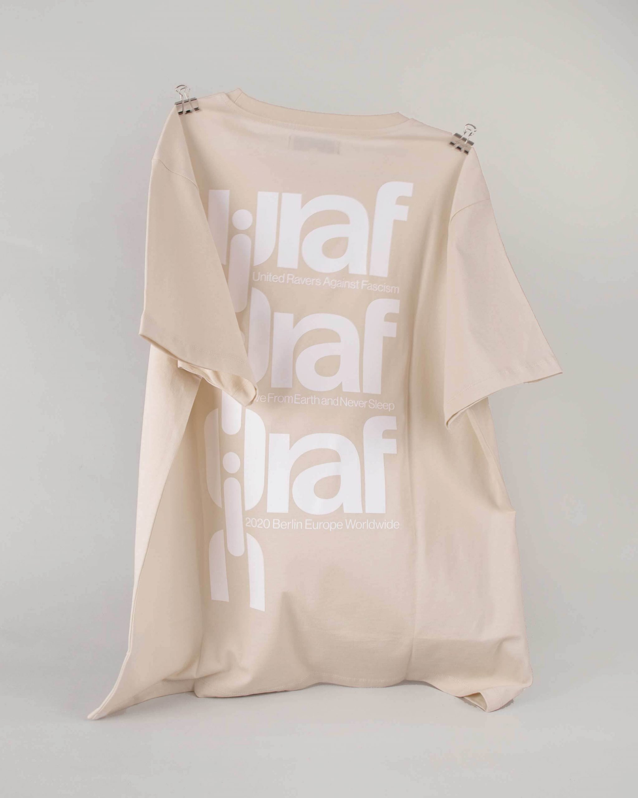
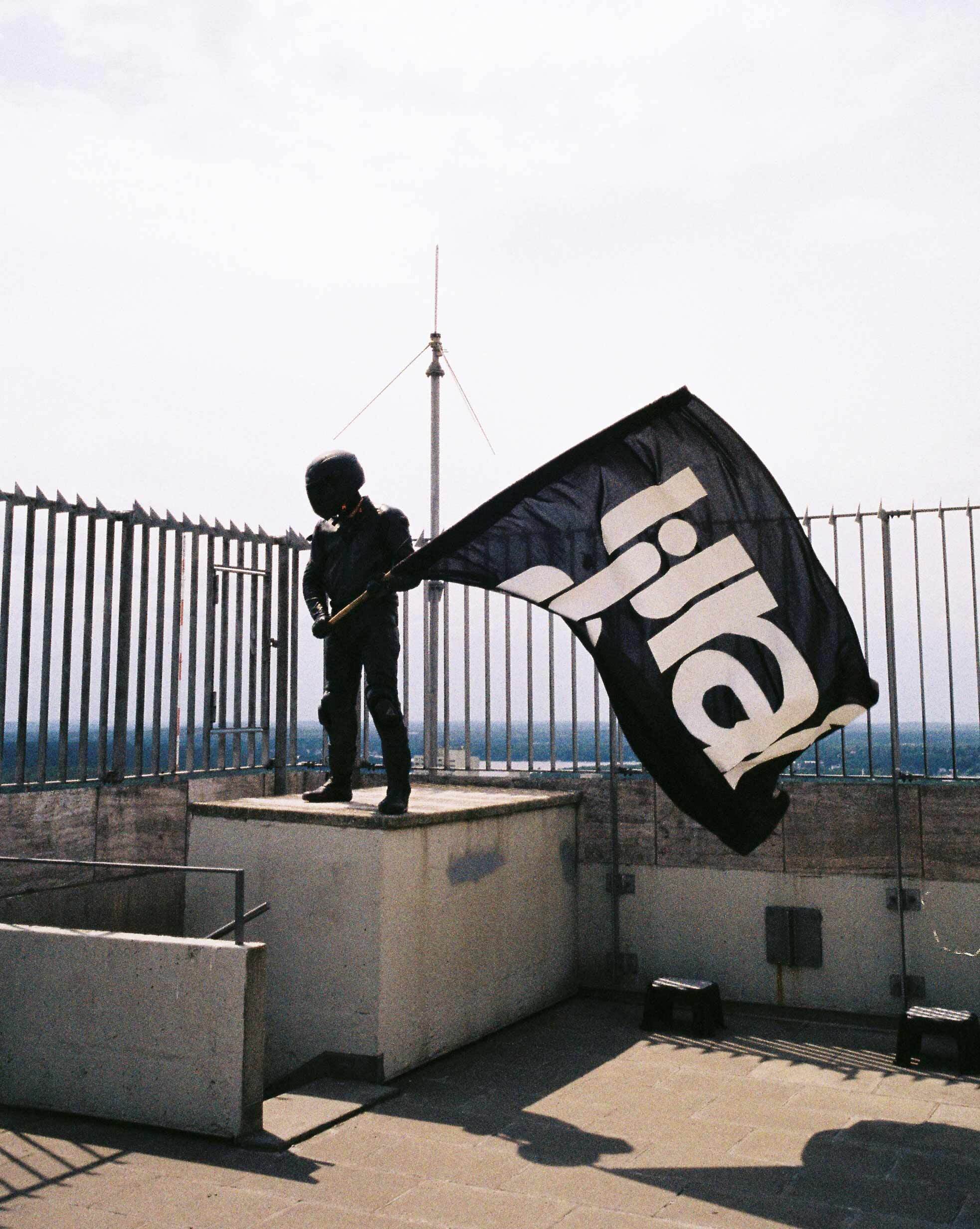
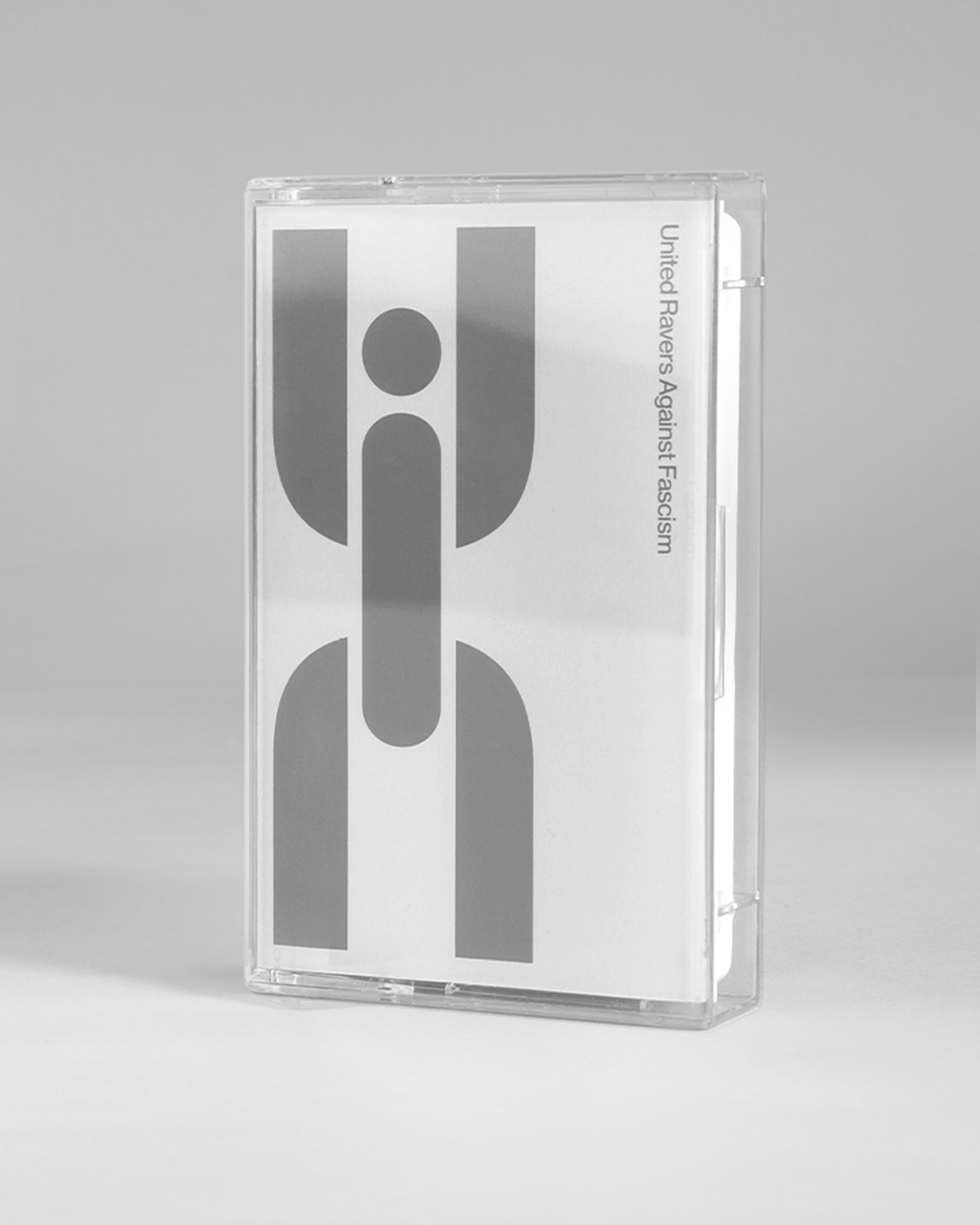
WiseType
2019
Foundry established
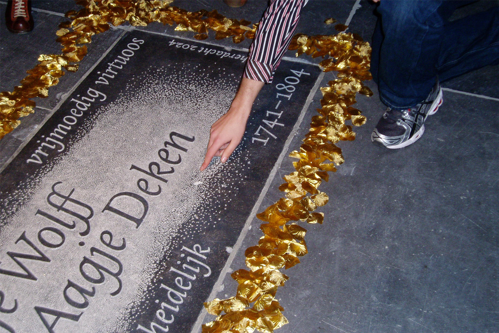
Entercourse of the New Age
2017
Exhibition geneva
Graphic Design, Kingston School of Art
2013–2017
Bachelors Degree